
Charts 3.1 & 3.2. Composition of Population in
Low- and High-income Economies, 1995
Exploring Charts 3.1 & 3.2
1. Study the information in Chart 3.1 for low- and
high-income economies in 1995. Then, answer the following questions about the population
trends shown.
- In low-income countries, which age range(s) contained the largest percentage of the
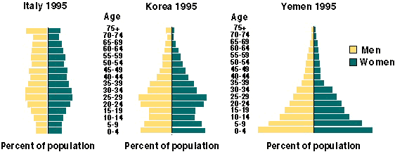
population? the lowest?
|
Enter your answer in the space below: |
Suggested answer: |
|
|
|
- In high-income countries, which age range(s) contained the largest percentage of the
population? the lowest?
|
Enter your answer in the space below: |
Suggested answer: |
|
|
|
- In a brief statement, compare the age composition of the populations for low- and
high-income countries for 1995.
|
Enter your answer in the space below: |
Suggested answer: |
|
|
|
- Considering your answer to question 1c, what type of social programs might be important
to meet the future needs of the largest age groups of each country income group?
|
Enter your answer in the space below: |
Suggested answer: |
|
|
|
2. Study the information in Chart 3.2 for low- and
high-income economies in 2025. Then, answer the following questions about the population
trends shown.
- In low-income countries, which age range(s) contained the largest percentage of the
projected population? the lowest?
|
Enter your answer in the space below: |
Suggested answer: |
|
|
|
- In high-income countries, which age range(s) contained the largest percentage of the
projected population? the lowest?
|
Enter your answer in the space below: |
Suggested answer: |
|
|
|
- Compare the age composition of the populations for low- and high-income countries shown
in Chart 3.2 with those shown in Chart
3.1.
|
Enter your answer in the space below: |
Suggested answer: |
|
|
|
- Compare the gender composition for low- and high-income countries shown in Chart 3.2. with those shown in Chart 3.1.
|
Enter your answer in the space below: |
Suggested answer: |
|
|
|
3. Read the definition of population momentum
in the glossary. Using Charts 3.1 and 3.2
as a reference, in which economic groups and years do you think this phenomenon exists?
Why?
|
Enter your answer in the space below: |
Suggested answer: |
|
|
|
4. Look at the shapes of the charts in Charts 3.1 and 3.2. What would a stabilized population look like? Explain.
|
Enter your answer in the space below: |
Suggested answer: |
|
|
|
5. a. What impact might population momentum have on the care of small children in a
country where a large proportion of the childcare duties are performed by daycare centers?
b. What about a population where elderly relatives provide childcare? c. Who are the
caretakers of small children in your country? d. What effect might population momentum
have on these arrangements?
|
Enter your answer in the space below: |
Suggested answer: |
|
|
|
6. What impact might an aging population have on the care of elderly people in a
country where a large proportion of these people live in nursing homes or elderly housing?
How are elderly people cared for in your country? What impact might an aging population
have on this care?
|
Enter your answer in the space below: |
Suggested answer: |
|
|
|
7. Match each of the following descriptions with the country below that illustrates the
trend described.

- The death rate is high, the birth rate is high, and there are a large number of children
in the population.
- There has been a sustained decline in the birth rate, but the proportion of the elderly
population has not yet become large.
- The birth rate has been low for a long period, and the elderly proportion of the
population is increasing.
|
Enter your answer in the space below: |
Suggested answer: |
|
|
|
Answers
Home
| Site Guide | Modules | What's SD? | SD
Post | Resources | About
DEP | Feedback


