|
|
| |

| Exploring Chart 2 |
Test Yourself |
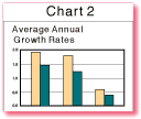
1. Study the information in Chart 2. What is happening to the average annual population growth rate in low- and middle-income countries over time?
2. According to Chart 1, what is happening to the population size in low- and middle- income countries over time?
3. How do you explain these two trends?
4. The table below shows population data for three developing countries. Complete the table by calculating the annual population increase for each country (divide the percentage by 100 to get a decimal, then multiply population size by the decimal figure), then answer the questions that follow.
| Country | Population |
Average |
Annual |
| 1980 | 38,000,000 | 2.7 | |
| 1995 | 56,000,000 | 2.8 | |
| Pakistan | |||
| 1980 | 83,000,000 | 3.0 | |
| 1995 | 130,000,000 | 2.5 | |
| Ukraine | |||
| 1980 | 50,000,000 | .2 | |
| 1995 | 52,000,000 | –.2 |
5. What effect might a declining population growth rate have on a country’s economy and environment?
6. Why might a country not want to slow its population growth?
Home
| Site Guide | Modules | What's SD? | SD Post | Resources | About DEP | Feedback| Copyright � 1998
IBRD/The World Bank |
[email protected] |