|
|
| |

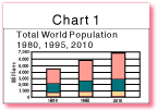
Chart 1. Total World Population by Country
Income Group 1980, 1995, 2010
| Exploring Chart 1 |
Test Yourself |
1. Study Chart 1 which shows the world population size by country income group for 1980, 1995, and 2010. What is the total world population for each year? How much will total world population have increased from 1995 to 2010?
2. Use the data in the table below to complete the following exercises.
1995 |
2010 |
|
(millions) |
(millions) |
|
| Low-income economies | 3180 |
3971 |
| Middle-income economies | 1591 |
1916 |
| High-income economies | 902 |
963 |
| Total World Population | 5673 |
6850 |
3. Use the Data Table to identify the five most populous countries in 1995 along with their populations, their regions, and their income groups, and fill in the following table:
| Country | 1995 population (millions) |
Region | Income group |
4. Use the Data Table to fill in the population information for China and India in the following table. Next, calculate the percentage of the world’s population that is represented by China and India for 1995 and 2010 and add that information to the table. (Divide each country’s population by the world’s population and multiply the figure by 100.) Then answer the questions that follow.
Population |
% of world |
Average |
Population |
% of world |
|
China |
.8 |
||||
India |
1.3 |
||||
World |
5,673,000,000 |
---- |
1.3 |
6,850,000,000 |
--- |
5. In 1995, four out of every five people in the world lived in low- and middle-income countries. As this percentage increases, what might be some of the impacts on the global economy? On the environment? On peace and security issues?
Home
| Site Guide | Modules | What's SD? | SD Post | Resources | About DEP | Feedback| Copyright � 1998
IBRD/The World Bank |
[email protected] |